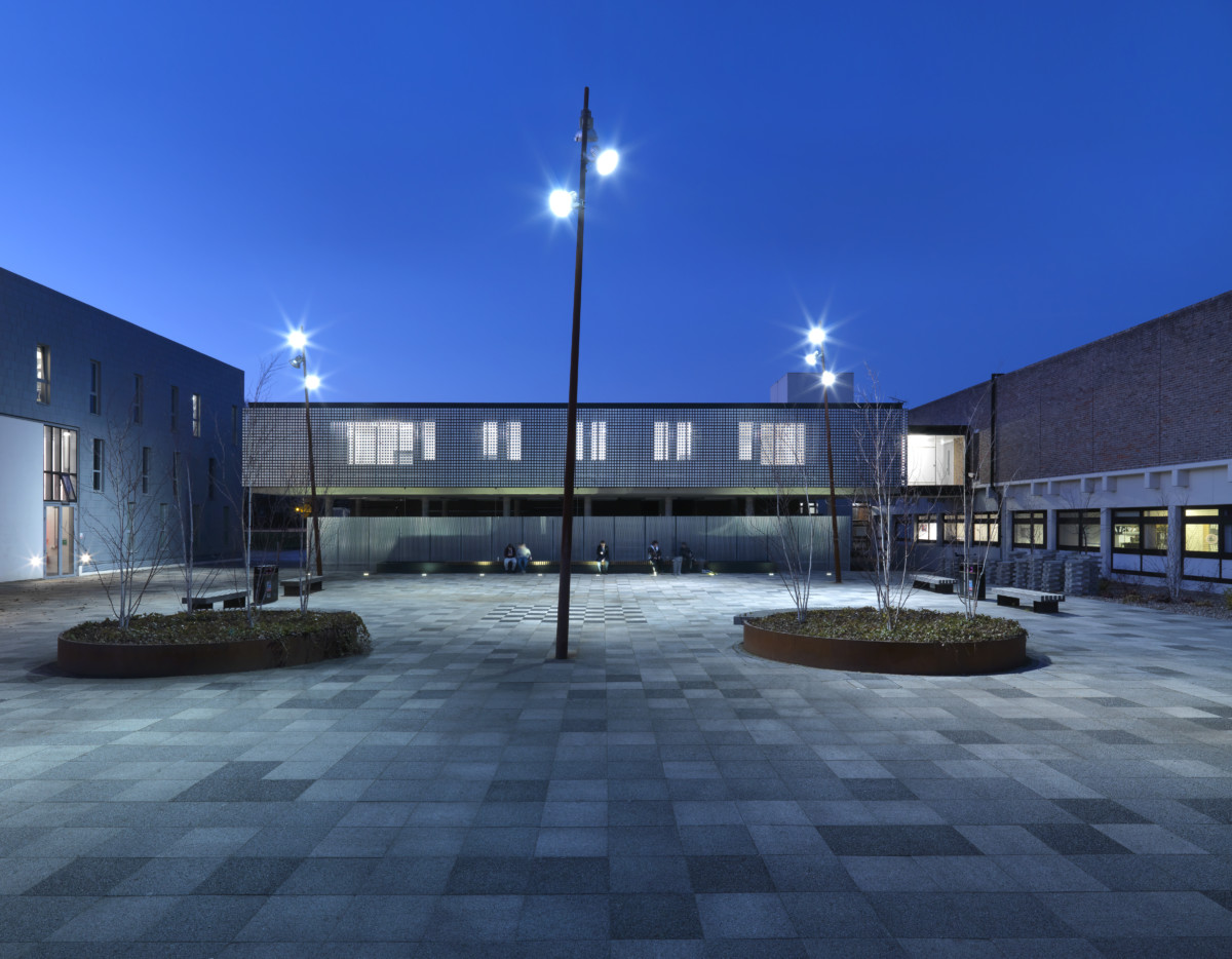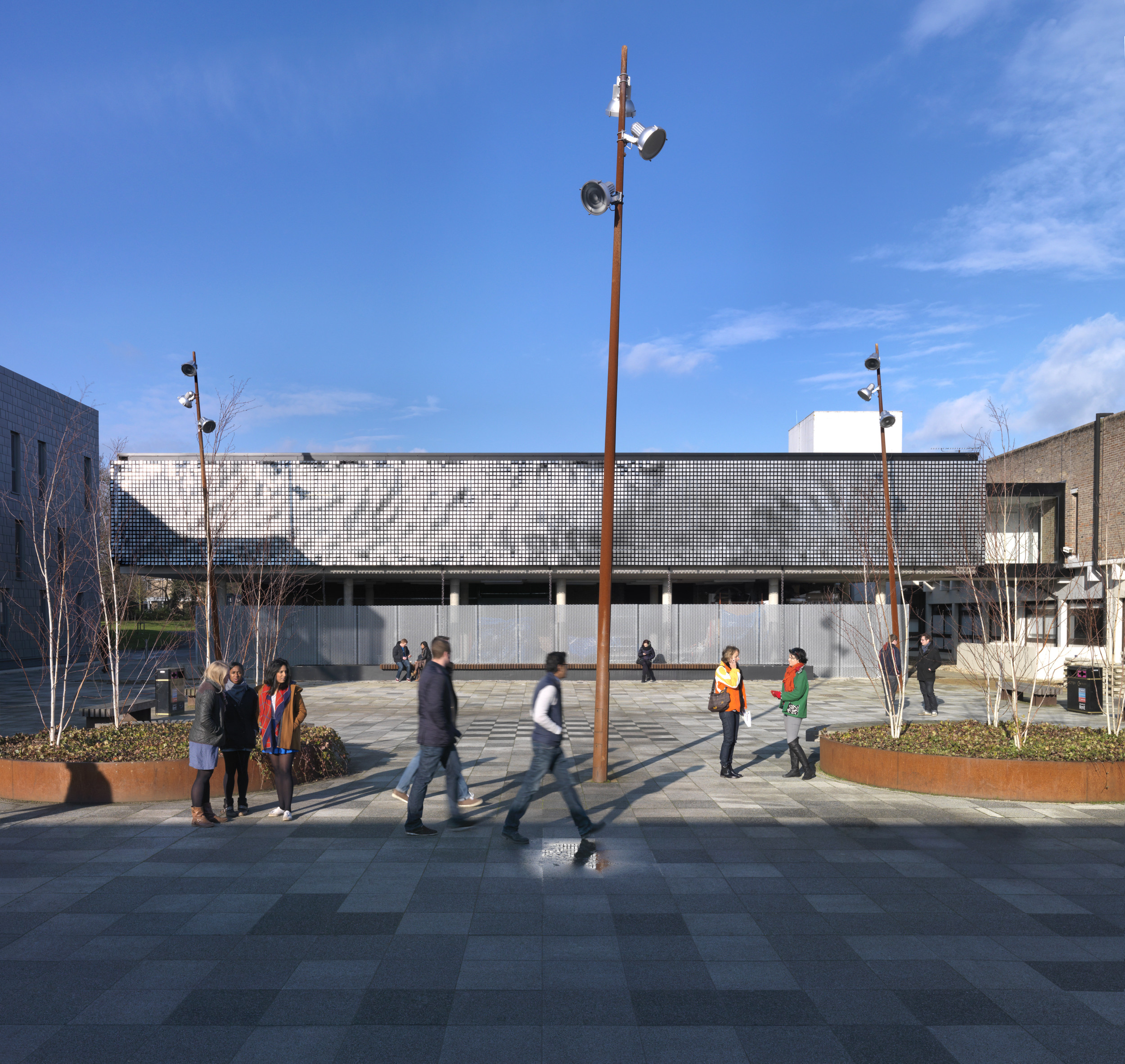
In the age of architecture as spectacle, it’s easy to forget that the majority of building making is not the latest city-defining tower in London or Doha or San Francisco. The new Digital Crit Space at the University of Kent is not a tower. It’s an extension to the university’s School of Architecture, and provides students and tutors with a flexible, digitalised space with which to critique work.
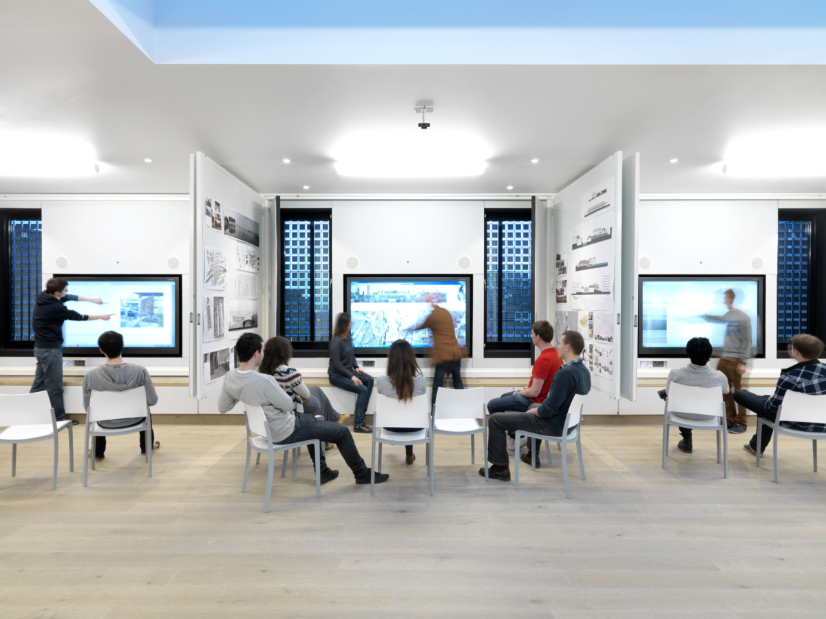
However, inspired by the work of American artist Ned Kahn, it also features a façade consisting of hundreds of wind-driven panels, which as well as serving as a sun breaker, beautifully animates the courtyard it overlooks, its rippling surfaces echoing the shape and movement of people as they cross the square. The interplay between the low-tech façade and its state-of-the-art digitalised interior sits behind each crit bay’s screen, which when pulled back reveals 70-inch U-Touch screens framed by windows looking directly into the façade – and so out and into the courtyard beyond.

As a design, Digital Crit Space caught everyone’s imagination – an appreciation recognised at the 2013 World of Architecture Awards, when it was awarded Façade of the Year, and featured on the front cover of Architects Journal, beating a number of huge and highly visible projects, buildings with super high-tech facades designed to inform, inflate, and drive capital city brands. Which is exactly the point: the Digital Crit Space’s façade is none of this; it’s small and it responds to nature – very simply and very wonderfully.